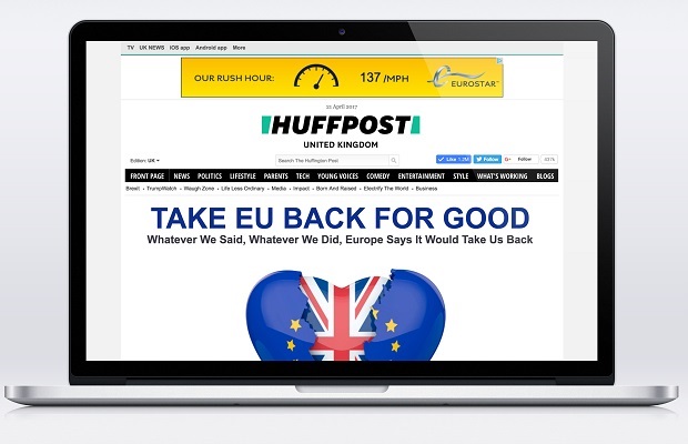
Internet news pioneer The Huffington Post is officially rebranding to “HuffPost” with a new logo and complete redesign of its digital presence.
This is the publisher’s first significant reimagining of the branding and site in its 12-year history, marking a new day for the company under Chief Executive Officer, Jared Grusd, and Editor-in-Chief, Lydia Polgreen.
“HuffPost is the pioneer of online journalism and continues to lead the digital news landscape. Our changes today build upon our heritage of continuous innovation” said Jared Grusd, CEO of HuffPost. “Today, we make a decided leap into our future. The rebrand and relaunch of our products symbolise our commitment to continually evolve to help our audiences connect with a world that is changing rapidly around them.”
The fresh look debuted this morning with a letter from Polgreen explaining the rebrand and her editorial vision for the company to HuffPost’s audience of nearly 200M UVs. HuffPost Head of Product, Julia Beizer, also wrote about the redesign and the thought process behind the new logo.
“HuffPost’s aspiration is to be the premier news and storytelling platform in the world. We want to reach people in the best possible ways, and in all the formats they love,” said Lydia Polgreen, Editor-in-Chief of HuffPost. “HuffPost is a place where the real conversation about the most important stories of our time is happening. The new design reflects our bold promise to help readers know what’s real and what really matters.”
“We started with what we believe sets us apart – our editorial voice: down to earth, cutting through what doesn’t matter and getting to what’s real,” said Julia Beizer, HuffPost’s Head of Product. “These thoughts inspired the forward-slash shape that brackets our name on the top of our site and stands alone as our app and social logo. The shape symbolises the company’s movement forward into the future, and subtly pays homage to our heritage as the first scaled digital-only news brand by evoking the forward slash found in URLs.”
Redesign highlights include:
● A new logo that leans into the future with a bold, italic font and brighter version of HuffPost’s brand-defining green.
● New homepage layout showcasing the best of HuffPost across politics, entertainment, lifestyle, and voices.
● Bold, visceral “splash” image that tells and shows the most important story of the day.
● Rich visual storytelling “splash cards” woven through the app and web front pages and built to travel across social networks, spreading the brand voice onto every platform.
● Prominent video player highlighting original news-driven video.
● Innovative InContent Reveal ad experience providing advertisers with an impactful way to reach audiences.
The new design recognises that readers experience HuffPost in many different ways – on social media, through Apple News, via next-gen services like Messenger bots and more. The cross-platform design ensures a consistent identity and experience across devices, desktops, and all on-and-off platform audiences to bridge the gap and carry the new look everywhere.
HuffPost partnered with Work-Order, a strategic design agency with deep experience in media, to bring a visual identity to the new strategic vision. Their work is woven through the new static logos and motion graphics.
Today, all 17 of HuffPost’s international editions have the new logo and branding. The full redesign will roll out for each edition later this year.
The new site is available to view at huffpost.com and m.huffpost.com in the US.

