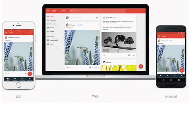
Google has updated the look of Google+ as it looks to respond to user feedback and put “Communities and Collections front and centre” than mimics the likes of Reddit and Pinterest.
In a blog post, Google announced that it will be redesigning the social network, following the company’s decision with axe its integration with other Google services earlier this year.
The revamped Google+ will be focused around two features of the current site: Communities, or mini-forums dedicated to a single topic, and Collections, a Pinterest-style function that lets users build out series of posts around a certain topic.
According to Google, users are joining 1.2 million Google+ communities each day.
“Whether it’s the Nonfiction AddictionCommunity, where people can be found discussing the best in Crime or Travel storytelling, or the Watch Project Collection, where more than 40,000 people are following an antique watch hobbyist, these are the places on Google+ where people around the world are spending their time discovering and sharing things they love,” said Eddie Kessler, director of streams.
The new look began to roll out this week and users will have to opt-in to the new version of Google+ on the web to see the changes.


I need better directions than what I have been given. They need to start at the beginning and tell us exactly what to do. Also, they need to allow us to post cost of item being displayed other wise we might as well be on Pinterest (which I am).