Positive brand perception is based not on a single moment but a culmination of interactions, explains Marc Schillaci, CEO of ecommerce specialist Oxatis Group. He discusses a four-step guide to delivering an optimised strategy that will make shoppers feel appreciated and valued at every point in their journey.
Consumers view brands through a single lens and expect an identical experience whether they are shopping in-store or on the web. From a retailer’s perspective, both platforms bring similar, intertwined challenges: attracting shoppers inside, tempting them with vibrant product ranges, navigating them through the store to inspire purchases and increase sales. Each step has a significant impact on brand perception, basket size and conversion rate, yet, while brick-and-mortar stores have sales staff on hand to provide additional support, in ecommerce the responsibility lies solely with the website.
Providing a superior experience gives brands a competitive advantage, yet many online retailers are still struggling to create this. Let’s look at techniques that can be employed on the web, not only to match the high street but exceed it.
1. Think SXO not SEO
Entering a high street store is straightforward. There is only one obvious way in – through a clearly marked door. Online, every door and window are potential entry points, all linked to queries made on a search engine.
Taking a customer-centric approach and moving away from search engine optimisation (SEO) to search experience optimisation (SXO) will help shoppers find the information they want in a language they understand. This means no longer focusing on keywords but providing a clear answer to every query and creating each landing page as a persuasive entity.
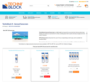
Skin care retailer Techniblock does this well. Product pages are built with a long description at the top to improve Google referral, but shown as an extract to the shopper to avoid the page being too text heavy.

https://www.techniblock.co.uk/best-spf-30-sunscreen-c102x2600820
2. Make a good impression
Online retailers have less than a second to win shoppers over so a fast-loading, ergonomic website design is essential. It can increase online revenue by over 20%, according to our research.
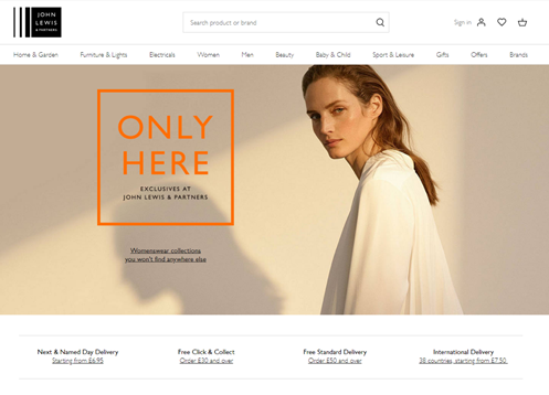
John Lewis’ website is a good example of an aesthetically pleasing digital store. A clean, uncluttered homepage makes it easy for shoppers to immediately find the product category they are looking for, while the ‘Only Here’ banner is an effective call to action.

3. Steer a clear path
Onsite search engines are great for discovering what customers are looking for. The best search technology is based on a semantic processing architecture, which ensures customers find the products they want regardless of spelling and typographical errors.
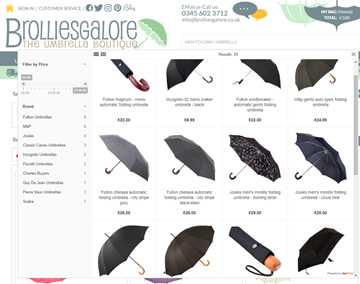
Many shoppers will be looking for a specific product, so the search box needs to be prominently positioned. It should also be linked to a faceted search feature, as umbrella boutique Brolliesgalore does, allowing customers to filter the results of their query.

Retailers can tweak results according to business requirements too, giving more relevance and weight to products they are most interested in selling.
4. Make payment pain-free
Conversion rates for online shoppers are typically far lower than in-store, so ‘prompt’ payment early in the journey. Adding a clearly visible pop-up basket on product pages that links directly through to the checkout is a neat way to encourage customers to complete their purchase immediately.
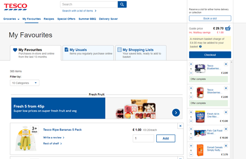
The basket is often used by shoppers to store wish lists, so integrate it into the header where it’s easy to access. Activate a dynamic basket on every page, as Tesco does, to prevent abandoned baskets or why not remove all navigation barriers by adding a ‘Quick Buy’ button.

Far from hindering interaction, digital allows brands to be closer to their customers. Thinking like an in-store sales advisor and helping the shopper easily find and pay for what they want creates a memorable experience that encourages return visits.

