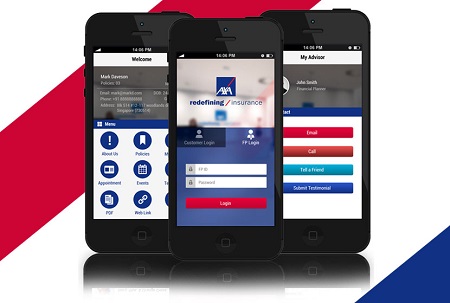
When it comes to top UK insurer’s mobile website performance, AXA leads the way and Quantum needs improvement , according to new research.
The findings from Dock9’s report into the digital insurance landscape, ranks 18 major insurers and aggregators – such as, AXA, Aviva, GoCompare and MoneySuperMarket – as the best and worst online quote-and-buy experiences.
It also revealed that nearly two-thirds of insurers and aggregators are neglecting mobile and tablet users.
Key findings:
• AXA was ranked best for online quote-and-buy experience
• Quantumn PLC was ranked the worst
• More than 1 in 4 major insurers and aggregators are ignoring mobile and tablet users (28%) by failing to design websites for these devices
• And those that do, are not touch-optimised (57%)
o This means customers have a longer quote-to-buy journey than necessary – typically websites that are touch-optimised save users nearly a quarter of the time
After researching the major UK insurers and aggregators, it found that more than 1 in 4 are ignoring mobile and tablet users (28%) by failing to design websites for these devices. And those that do, nearly two-thirds, are not touch-optimised (57%). This means customers have a longer quote-to-buy journey than necessary – typically websites that are touch-optimised save users nearly a quarter of the time.
Numerous reports have confirmed more people are now using their mobiles – instead of their desktops – to browse the web. Yet, a significant number of insurers appear to be either ignoring this shift completely, or having built basic compatibility with mobile and tablet, think their work is done. In an increasingly competitive mobile-driven industry, this should set the industry’s alarm bells ringing, urging more businesses to take advantages of the big opportunities that touch devices offer.
Mark Lusted, managing director at Dock9 says, “For years innovation hasn’t been a primary focus for the insurance industry. But in the start-up era, where insurtech start-ups are attracting more consumer attention, this needs to change. Our research highlights best practices that businesses can learn from – whatever insurance niche they’re in.
“Those that rank highly have broken the traditional inertia in the industry by adopting modern user-centred design processes, including rapid prototyping and user testing. Incumbent insurers that do this can reap the benefits – after all, they already have the capital, know-how, regulatory approval and a sizeable number of customers. AXA is a good example of this, having invested in a fully responsive site that is touch-responsive they prove to be one of the biggest insurance giants in the UK.”
Building on last years’ report, Dock9’s 2017 research focuses on quote-and-buy journeys for commercial lines – including 10 commercial insurance providers and eight aggregators such as Aviva, AXA, Directline, GoCompare, Hiscox and MoneySuperMarket. Through heuristic reviews and real-user testing, it ranks players in terms of the best and worst online quote-and-buy experiences.
Overall winners for online quote-and-buy experience:
• #1 AXA (95.65%)
• #2 Go Compare (95.45%)
• #3 Simply Business (95.34%)
And those bringing up the rear are:
• #18 Quantum PLC (60.50%)
• #17 Markel Direct (77.05%)
• #16 The Insurance Octopus (78.82%)
Other key findings include:
• Aggregators still on top – with few exceptions, UK insurance providers are lagging behind the aggregators
• GoCompare continues to set the bar – they were the highest scorers in last year’s report and continue to put UX as a priority. Their website is pleasing, simple, designed for mobile and touch-optimised for touchscreen devices
• AXA comes up trumps – out of all the insurance providers reviewed, AXA offers the best online quote-and-buy experience. Similar to GoCompare, its layout is simple and easy to navigate, offering customers help at every opportunity and designed with mobile devices in mind – not just desktop
Gareth Howell, Managing Director, Direct & Retail Partnerships, AXA Insurance says, “Making life easier for our customers is very important, which is why we put a great deal of time and effort into making sure potential policyholders are not overwhelmed when buying insurance from our website. We are delighted that our efforts have been recognised and will continue to work on making our quote and buy systems as friendly as possible.”
Mark Lusted, managing director at Dock9 adds, “We’ve also found that businesses are throwing away money on big ‘rip and replace’ projects under the assumption that a huge core systems overhaul is the only way to provide better customer experiences. Often it is far more effective to build middleware layers that interact between their systems and the front end, allowing a workaround of the incumbent technology – and saving big bucks. ”
Methodology
Dock9’s UX team used a combination of their heuristic process and user testing with 50 users to review all 18 companies. The heuristic process involved Dock9 experts reviewing each website and giving a standardised score of 1, 0 or -1 in 52 different categories. Each key area was reviewed against a set of six heuristic categories with a total of 52 individual review points. Dock9 combined this with real-world user testing with 50 users, setting tasks and analysing feedback and results.
The companies reviewed include Aviva, AXA, Business Insurance 247, Premier BusinessCare, Quantum, Caunce O’Hara, Digital Risks, Direct Line, Simply Business, Towergate Insurance, Endsleigh, Go Compare, Hiscox, The Insurance Octopus, UK Insurance Net, Markel, MoneySuperMarket and PolicyBee. These companies vary across a range of product lines including professional indemnity, public liability, directors and officers, commercial property and employers’ liability.
